Key Intake
Q1: What is an anchor chart in teaching?
It’s a co-created classroom visual that captures and displays key lesson content to reinforce learning.
Q2: How do teachers use anchor charts?
They use them during instruction to record strategies or ideas, then display them for ongoing reference.
Q3: Why are anchor charts effective in classrooms?
Because they combine text and visuals, helping students recall, connect, and apply concepts.
Q4: Which subjects use anchor charts the most?
They’re common in reading, writing, and math, but effective across all core subjects.
Q5: How can I make an anchor chart step by step?
Start with a core concept, brainstorm key ideas with students, and record them visually.
Q6: What’s the difference between an anchor chart and a poster?
Posters are pre-made visuals; anchor charts evolve with instruction and student input.
Table of Contents
Introduction
What is an anchor chart and why do teachers swear by them? Ever walked into a classroom and noticed colorful posters filled with words, arrows, or sticky notes? That’s not just decoration, it’s strategy. Teachers use anchor charts to make thinking visible and learning stick. According to Edutopia, visual cues like anchor charts can improve student recall by up to 65%. They’re not art projects; they’re brain-based learning tools that turn classroom walls into living textbooks.
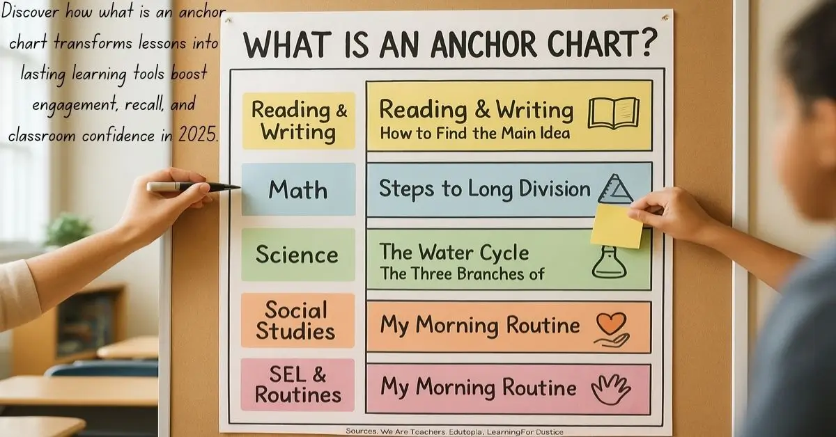
In short, an anchor chart is a visual reference created during lessons to capture key concepts, strategies, or steps. It’s built collaboratively with students and displayed as a long-term learning aid.
Quick Answer
An anchor chart is a visual learning tool created during instruction to capture key ideas, strategies, or processes so students can revisit them later for guidance and practice.
Built collaboratively with students and displayed in the classroom, it anchors learning across subjects, turning each lesson into an ongoing reference for independent work and skill retention.
Why Do Anchor Charts Work? The Science Behind the Visuals
Understanding what is an anchor chart helps explain why they work so effectively, the brain remembers images and structure faster than isolated words. Dual-coding theory (Paivio, 1986) shows that pairing visuals with verbal instruction improves comprehension and retention.
Truth is, students often forget abstract instructions, but when they see them visualized through anchor charts, they reconnect instantly. For example:
- In reading, anchor charts remind students how to infer meaning.
- In math, they show step-by-step problem-solving methods.
- In science, they break down processes like the water cycle.
According to the Journal of Educational Psychology, students using visual learning tools score 23% higher on conceptual tests than those who don’t.
Types of Anchor Charts Teachers Use Across Subjects
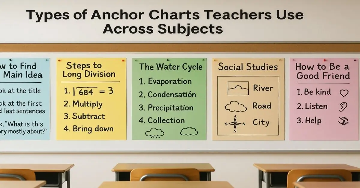
Every subject uses anchor charts differently, but the goal stays the same visible, lasting learning.
- Reading & Writing Anchor Charts: Help track story structure, summarizing, or grammar rules.
- Example: “How to Find the Main Idea” chart.
- Math Anchor Charts: Display formulas, problem-solving steps, or number patterns.
- Example: “Steps to Long Division.”
- Science Anchor Charts: Map scientific cycles, lab safety, or experimental design.
- Social Studies Anchor Charts: Visualize timelines, map reading, or civic processes.
- SEL & Classroom Routine Charts: Promote empathy, listening skills, and daily procedures.
How to Make an Anchor Chart Step by Step?
Creating anchor charts doesn’t require design skills, just purpose and participation.
Step 1: Choose your lesson focus.
Step 2: Brainstorm with students.
Step 3: Record key ideas on large chart paper.
Step 4: Add visuals, arrows, and examples as you go.
Step 5: Display it prominently in the classroom.
Pro Tip: Use bold colors for headings, black for text, and visual icons (like stars or arrows) for emphasis. Digital classrooms can use online whiteboards or apps like Jamboard and Padlet for the same collaborative effect.
Anchor Charts vs. Posters: What’s the Difference?
Posters decorate, while Anchor charts instruct. Posters are pre-made visuals; anchor charts are co-created, living tools.
When students help make them, they’re more invested and likely to use them. Think of posters as static displays and anchor charts as interactive frameworks. One teaches through creation; the other only reinforces after the fact.
How Teachers Use Anchor Charts to Boost Engagement?
Teachers use anchor charts to turn passive listeners into active participants. During instruction, students help identify what belongs on the chart, making it personal and memorable.
For instance, an ESL teacher might create a bilingual vocabulary anchor chart with visuals for each term, helping students build contextual understanding faster. Reading coaches often track comprehension strategies like “Ask Questions” or “Visualize as You Read.” Homeschool parents can adapt the same idea using craft paper and markers on kitchen walls.
Result: More engagement, fewer “What do I do next?” questions.
What are the Benefits of Using Anchor Charts?
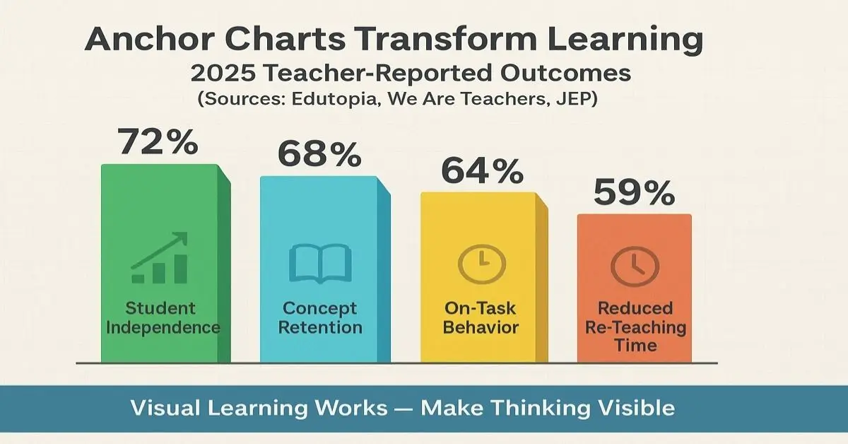
- Cognitive: Students retain visual data longer.
- Behavioral: Visual cues reduce off-task behavior.
- Instructional: They reinforce autonomy, students look before asking.
The Data Speaks:
A 2023 Education Week survey showed that 74% of K–8 teachers found anchor charts improved independent problem-solving.
Truth is, anchor charts are scaffolds, they build confidence while fading teacher dependence.
Tips to Keep Anchor Charts Effective
- Keep text large and legible from across the room.
- Limit information to one concept per chart.
- Rotate old anchor charts to keep walls fresh and uncluttered.
- Use sticky notes to adapt charts for review sessions.
- Involve students in revising or updating them after assessments.
Digital classrooms can snap photos of anchor charts for online sharing, extending their lifespan beyond the classroom.
What are the Challenges and How to Avoid Them?
Even great tools can fail when overused. Common pitfalls include:
- Clutter: Too many anchor charts confuse students.
- Neglect: Unused charts become wallpaper.
- Over-design: Too decorative = less instructional focus.
The key? Intentionality. Create anchor charts when the concept demands visual support not as filler.
How Anchor Charts Support Diverse Learners?

Anchor charts are inclusive by design. For special education teachers, they provide structure and visual reinforcement. ESL instructors use bilingual labels and icons to reduce language barriers.
Curriculum designers rely on standardized anchor charts for consistency across grades. This helps align visuals with learning goals while maintaining flexibility for teachers.
In short, they help every learner regardless of ability or language, so they can feel guided and empowered.
Expert Insight: Why They’re Here to Stay
“Anchor charts are one of the most powerful formative tools in a teacher’s toolkit,” says Dr. Linda Darling-Hammond, education researcher and president of the Learning Policy Institute.
“They externalize thinking, making invisible processes visible.”
And in an era of AI-driven learning, anchor charts are a tactile counterbalance reminding us that human connection and visible thinking still matter.
Sources
The insights and strategies shared in this guide are supported by leading educational authorities and teacher resources that emphasize effective visual learning practices and the evolving role of anchor charts in modern classrooms:
- We Are Teachers: A trusted K–12 educator hub offering practical classroom strategies and deep dives into why and how to use anchor charts.
- Edutopia: An initiative by the George Lucas Educational Foundation providing evidence-based teaching insights and research-backed classroom innovations.
- International Literacy Association (ILA): An academic body advancing literacy instruction through resources like Imitate and Innovate Anchor Charts.
- School Poster Printers: A professional educator platform offering data-driven guides on how anchor charts improve student engagement and retention.
- Inquired: A leading voice in inquiry-based learning that explores how anchor charts act as visual anchors for student understanding.
The Bottom Line
Truth is, what is an anchor chart isn’t just a question, it’s a classroom philosophy. These visual learning tools continue to redefine how teachers engage, support, and empower students. Whether in a traditional school, homeschool setting, or digital classroom, anchor charts turn walls into living textbooks and ideas into action. Their relevance in 2025 proves that visible thinking and collaborative learning aren’t trends, they’re timeless teaching essentials.
Author Bio
Maya Thompson is a Literacy Coach & Curriculum Strategist with over a decade of experience helping K–8 educators design effective visual learning tools. She specializes in literacy development, classroom engagement, and evidence-based instructional design.